In today's digital age, harnessing the dynamic nature of the internet is crucial for any organization that aims to engage its audience effectively. One of the core strategies employed to achieve this is responsive design, a method that ensures web experiences remain consistent and adaptable across a multitude of devices. As technology continues to evolve, so too do the expectations of users, who now demand seamless interactions whether they are accessing a website on a mobile phone, tablet, or desktop computer.
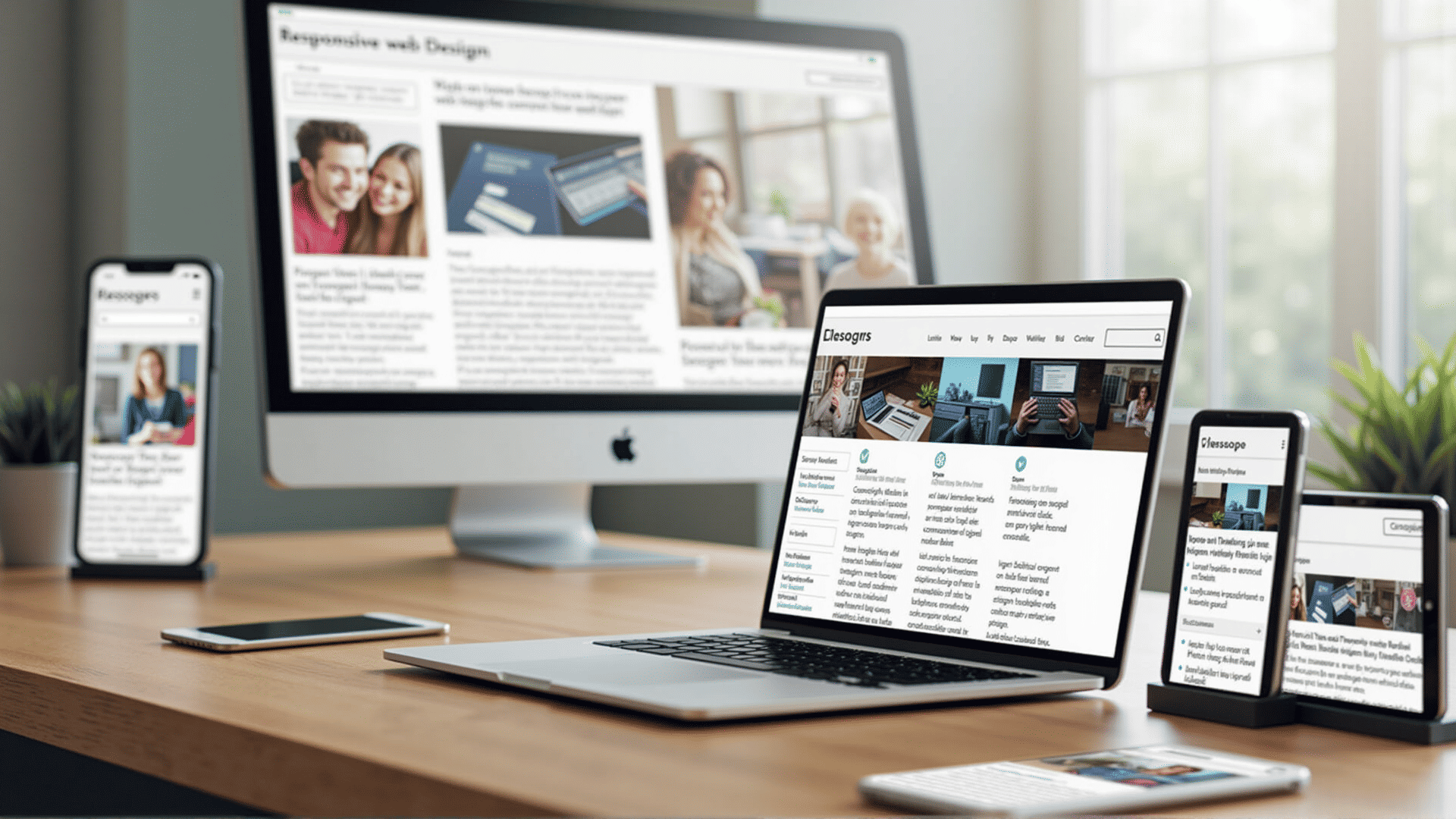
At its heart, responsive design is about flexibility and adaptability. Unlike traditional web design that might require separate versions of a site for different devices, responsive design uses fluid grids, flexible images, and media queries to adjust a webpage's layout in real-time. This adaptability ensures that users have a consistent experience regardless of the device they are using. It also means that as new devices with varying screen sizes and resolutions are introduced, the website remains accessible without the need for significant redesigns.
The significance of responsive design is underscored by the increasing reliance on mobile devices for internet browsing. Studies have shown that a vast number of users now access the internet primarily through their smartphones. This trend necessitates that websites are not only optimized for smaller screens but are also designed to load quickly on mobile networks, providing an uninterrupted experience. A site that fails to do so risks losing potential users who may become frustrated by a cumbersome interface or slow loading times.
Moreover, responsive design enhances search engine visibility. As search engines continually adjust their algorithms to prioritize mobile-friendly websites, having a site that is optimized for all devices improves its chances of ranking higher in search results. This increased visibility can drive more traffic to the site, improving engagement and ensuring that the content reaches a wider audience.
Another advantage of responsive design is its cost-effectiveness in the long run. Maintaining separate desktop and mobile sites can be resource-intensive, requiring more time and effort for updates and maintenance. Responsive design streamlines this process by offering one cohesive site that adapts automatically across all devices, simplifying updates and reducing overhead.
Beyond the technical benefits, responsive design places a strong emphasis on user experience. By ensuring that content is accessible and visually appealing on any device, users are more likely to engage with the content and spend more time on the site. This improved user experience can lead to greater user satisfaction, encouraging them to return and potentially establish a long-term relationship with the brand or organization.
In conclusion, responsive design is an essential component of modern web development, playing a critical role in building adaptable and engaging online experiences. As the digital landscape continues to shift, those who leverage the power of responsive design will be better equipped to meet the evolving needs and expectations of users, ensuring that their online presence remains robust and effective. Embracing this approach not only enhances user experience but also strengthens an organization's ability to reach and resonate with their audience in an increasingly connected world.